
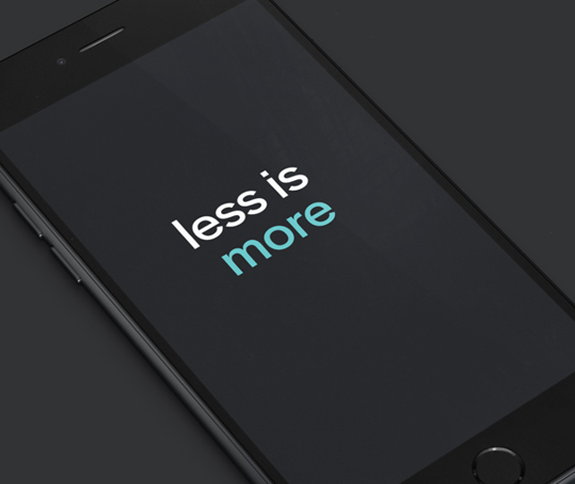
Honest design principles... less is more
I'm not a fan of rules being imposed on designers. I feel it stifles creativity and the 'question everything' ethos involved in the creative process. But essentially this statement defines the design process in a nutshell. The process of researching, inspiring, channelling and filtering the options into the most efficient effective solution. This takes skill, talent and time to make effective and informed choices. This is of course essential in all areas of design but even more so in the fast pace of the digital world.
Efficient well designed 'Honest' experiences, products, applications and devices enable business and life in general to operate more efficiently and effectively. Good design feels good and makes you feel good. It's this honesty that helps make the world a better place to be.
I recently read this great article on honest web design.
I was also quite surprised to find some interesting principles from the team working at Microsoft on Metro:
Clean, Light, Open and Fast
We took an approach that we call “Fierce Reduction” to remove any elements in the UI that we felt were unnecessary; both visual elements and feature bloat. It allows us to shine a focus on the primary tasks of the UI, and makes the UI feel smart, open, fast, and responsive.
Alive in Motion
The transitions between screens in a UI are as important the design of the screens themselves. Motion gives character to a UI, but also communicates the navigation system, which helps to improve usability.
Celebrate Typography
Our design inspiration is very typographic, and it felt like it was time for User Interfaces to be uncompromising about type as well. Type is information, type is beautiful.
Content, Not Chrome
It’s the content on the phone that people want, not the buttons. Reducing the visuals on the phone that aren’t content will help you create a more open UI, and it also promotes direct interaction with the content.
Authentically Digital
Finally, we believe in honesty in design. A user interface is created of pixels, so in Metro we try to avoid using the skeumorphic shading and glossiness used in some UI’s that try to mimic real world materials and objects. I agree with a lot of what is mentioned here and it's great to see such core design principles great being embraced in the digital world more seriously that it used to.