

E&M Estates Management
Brand refresh and website redesignE&M Estates Management needed a digital presence that matched the professionalism and reliability of their service. The existing brand and website lacked clarity, confidence, and accessibility.
Sector
Professional ServicesVisit site
e-m.uk.comThe challenge
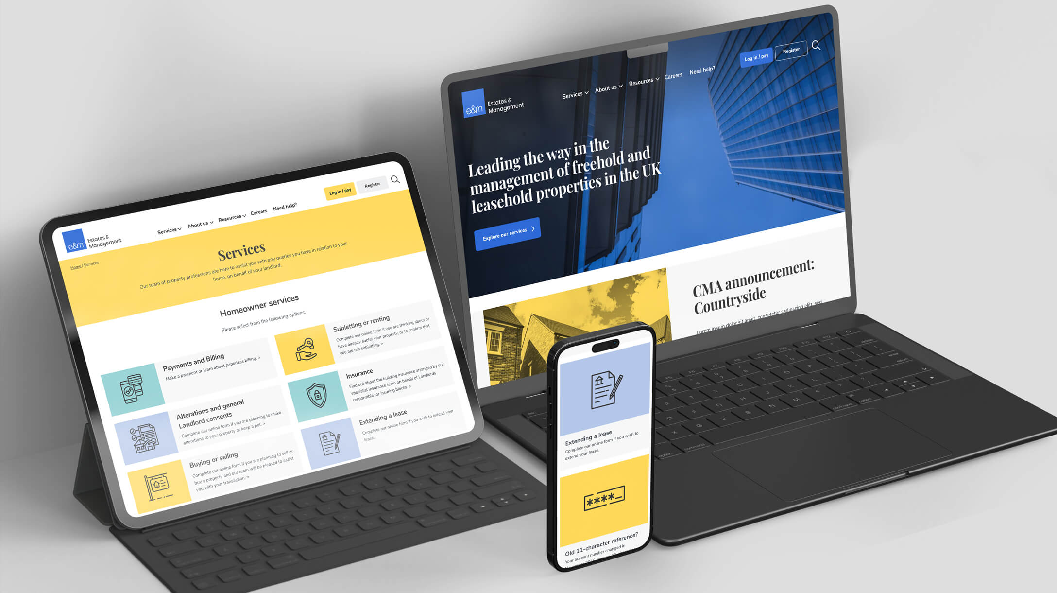
A site thats clean, modern and scalable
Property management websites are often cluttered and hard to navigate. The challenge was to simplify the experience while clearly communicating trust, expertise, and transparency to residents, property owners, and partners.
Clarity and accessibility were essential.
Services employed
The solution
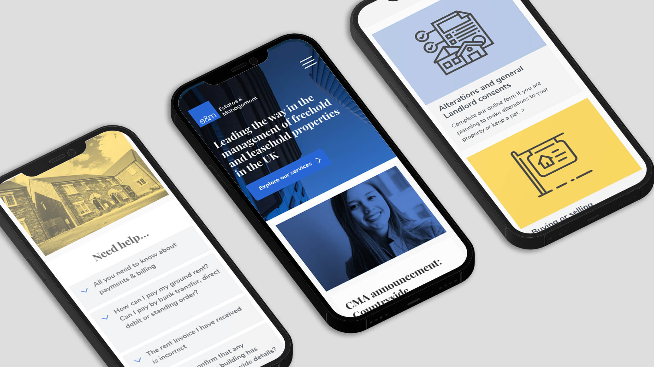
Accessibility built in
Intuitive and easy to navigate
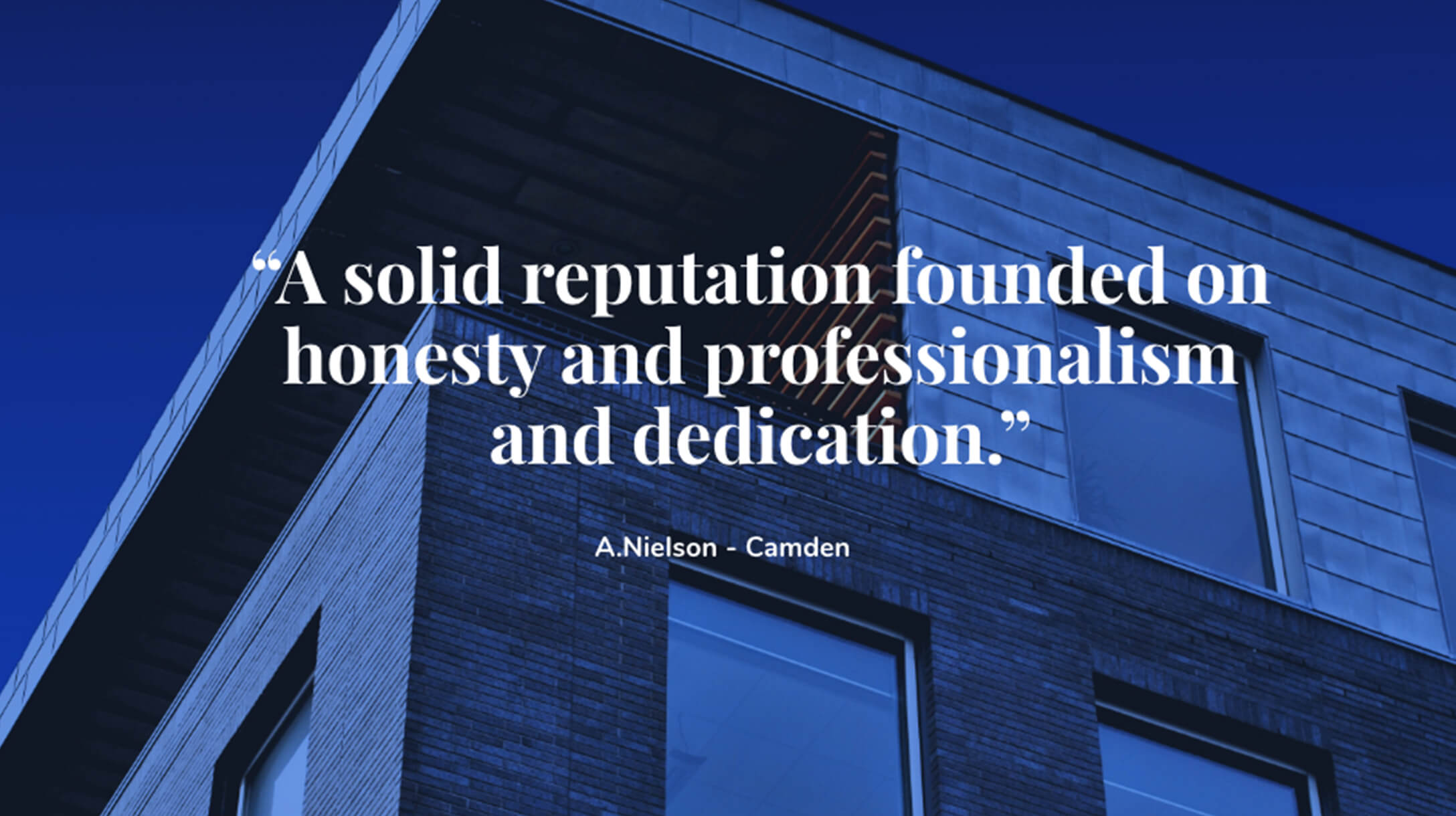
We stripped things back. The refreshed brand focuses on calm confidence, using a restrained colour palette, clear typography, and a consistent visual language.
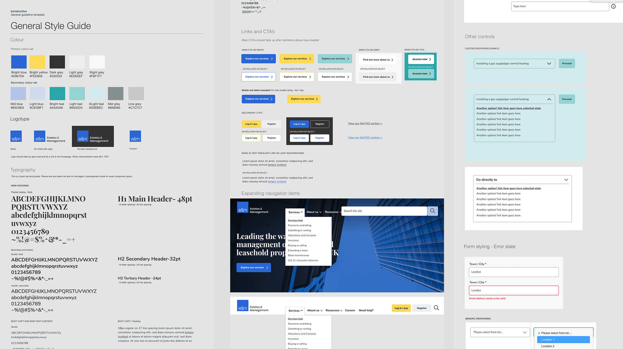
The website was designed as a modular system, allowing content to be structured clearly and reused across the site. This keeps the experience consistent and makes future updates simple and flexible.
Accessibility was built in from the start, with strong contrast, clear hierarchy, and intuitive navigation.
We worked closely with E&Ms development partner, who led the development. Ongoing collaboration ensured the modular design translated seamlessly into a robust, performant website that stayed true to the original vision.


The result
A clear, accessible digital presence
The site perfectly reflects the quality of service E&M Estates Management delivers every day. Its intuitive and easy to use for a wide demographic. With a diverse and future proof set of components that will scale and grow as they do.
